Te Pū Oranga Whenua
Branding / Website
+
Creative: Threaded
Brand strategy and project management: GoodSense
Client: Produced for wāhine-led agribusiness collective, Te Pū Oranga Whenua.
Project brief
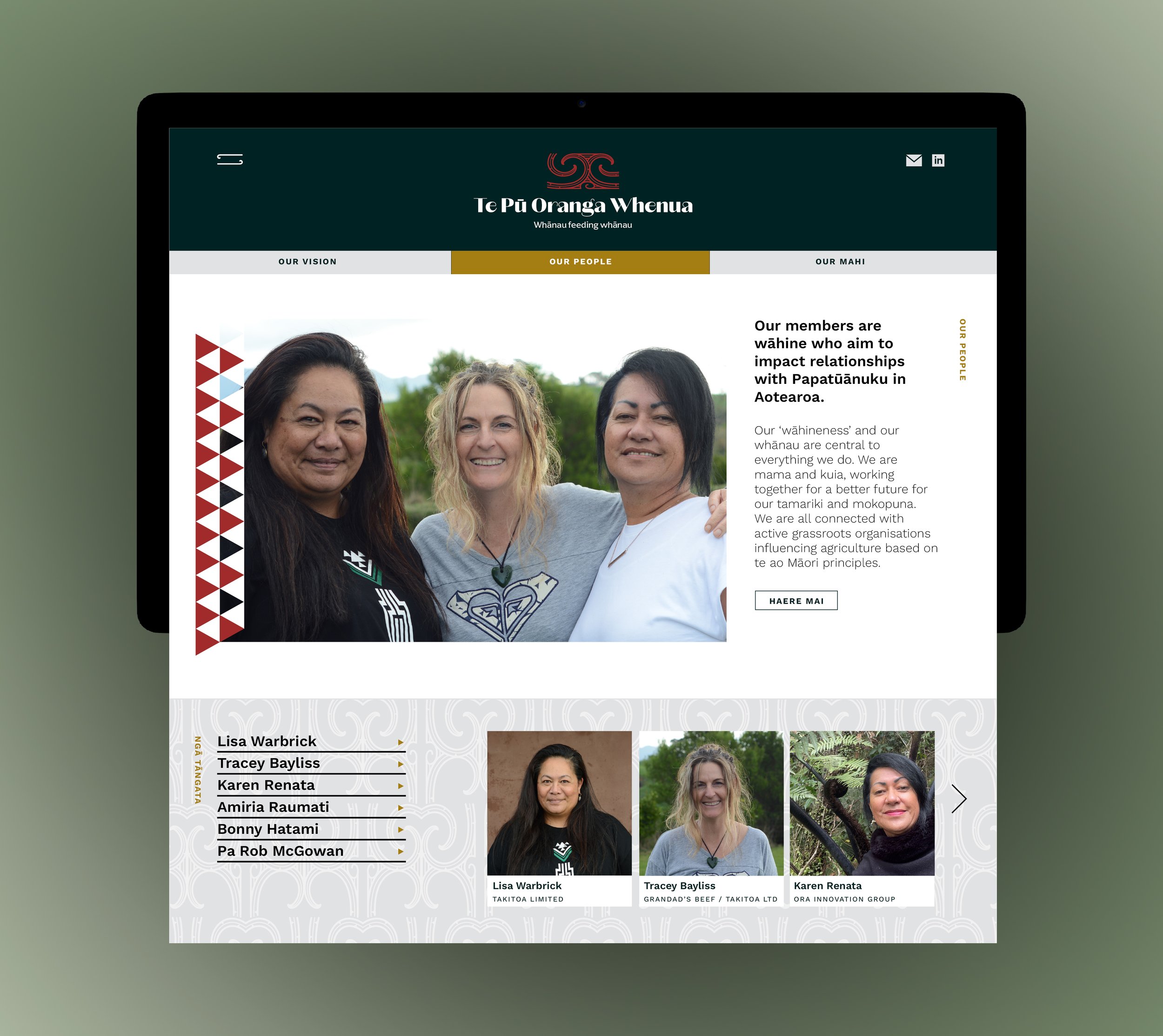
Te Pū Oranga Whenua | Whānau feeding whānau
We were tasked with designing a tohu to represent this proudly a wāhine-led collective in the Agricultural sector (with members' mahi spanning soil, meat, oils, forests and food), and all that it stands for.
Te Pū Oranga Whenua connect and awhi whānau who nurture te taiao as they farm. They are mātauranga-based, wielding science and customary knowledge to tautoko whānau, hapū and iwi in healing their land and honouring Papatūānuku.
Te Pū Oranga Whenua is an inter-regional collective of Māori agribusinesses led by wāhine. The collective is a not for profit organisation. Its members work together to build profitable, sustainable whānau-owned businesses and relationships that help others make progress on common issues.
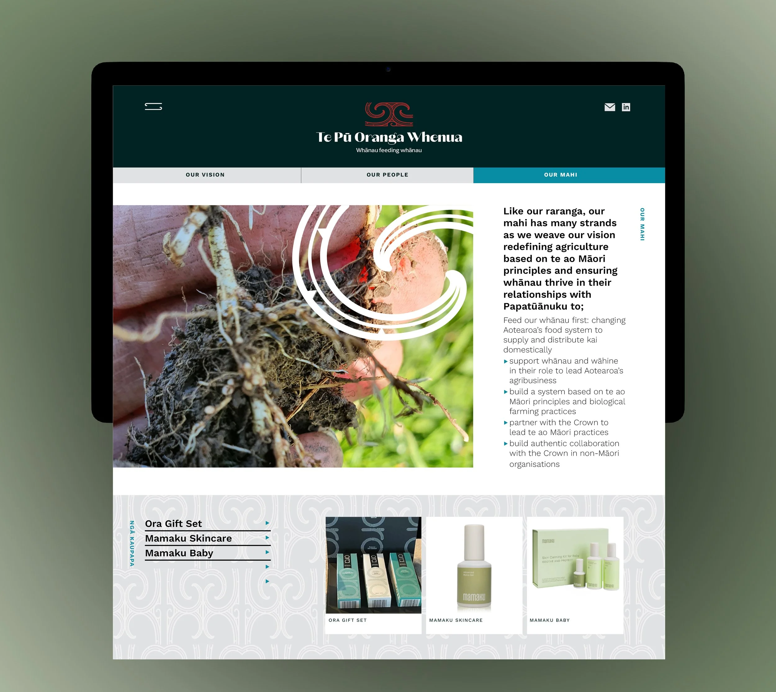
The members are redefining agriculture based on te ao Māori principles; producing skincare products from sustainably harvested native plants (rongoa); researching how to rehabilitate forestry blocks and using the whole-of-mānuka value chain, and working on indigenous genomics and collective land governance.
They make decisions together, based on a shared wāhine Māori view: that Te Ao Māori and mātauranga Māori (our Māori worldview knowledge) will help us solve the challenges we face, and that our people have the skills to lead the way.
The goal is to change the food system in Aotearoa to build strong, resilient rural communities and create opportunities for whānau to own their own businesses. To do this, we’re focusing on a kaupapa (initiative) of whānau feeding whānau first, of healing Papatūānuku (mother earth), and of doing things in ways that work for Māori.
That means strengthening whānau leadership and ensuring a whānau voice in how land is used, addressing data sovereignty, and creating decentralised, smaller businesses. It also means blending scientific data with mātauranga Māori and sharing resources.
Design response
The backbone of this tohu was to ensure it represented the kaha/strength and courage of wāhine, the whanaungatanga/togetherness and integral connection we have to each other and our natural environment.
Whakarongo ki ta taiao: This tohu was inspired by te kāhui o Matariki/the cluster of stars which make up Matariki (representing Mother/daughter relationships through these whētu - the eyes of Tāwhirimātea – and, the overall health and wellbeing of us and our natural environment.
Every aspect of te taiao is represented in the whetū that make up Matariki, therefore the moko kauae design is modelled off their position. Te taiao was born out of the separation of Tāwhirimātea’s parents, and it was his anger, frustration, and sadness (in regard to their separation) that caused him to tear his eyes out, crush them and cast them to the heavens in to the chest of his father.
Aho connection: Here the moko kauae references the connection of wāhine to wāhine - right back to Papatūānuku. A moko kauae is a sign of feminine strength, mana, honour and responsibility, it is a visible mark on the chin which represents connection to ones whakapapa and tupuna. Shedding of blood, representing journey, healing, rebirth and recovery.
The colour is influenced by the deep red clay of Kurawaka, and symbolic of Hine-ahu-one - the first woman born from clay and creator of people.